Berlin Covid-19 Dashboard - a data visualisation dashbpoard built in Python with Streamlit
As we approach autumn and winter of 2020, and the number of Covid-19 cases begin to rise again across Europe, I wanted to find a way to keep track of my local situation. This is for my own interest and because some of the companies I work with are restricting who can enter the office based on the incidence of Covid-19 cases in their respective districts.
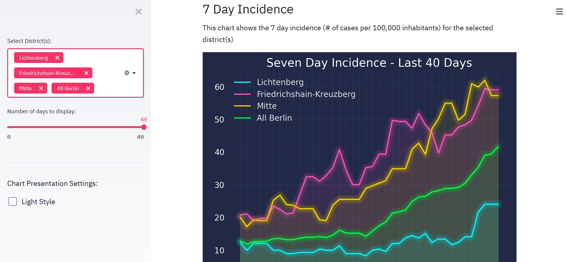
I became frustrated trying to get to the up-to-date figures for my area, so I decided to build a dashboard (around 6 months after all the cool kids started doing it) using Streamlit. I extract the data directly from the official figures posted on berlin.de, and then manipulate the data with pandas to make it show the information I want.
I have the default set to Lichtenberg (my home district) so that I just have to refresh the page to see the information I want, but I used Streamlit's selectbox function to allow the user to choose their own district, or a calculated 'All Berlin' field. The period can be adjusted using a slider.
I deployed the application to the cloud using Heroku. The code can be found on GitHub.