Making Bar Chart Races in Matplotlib using 'gif' and 'bar-chart-race' packages.
Introduction
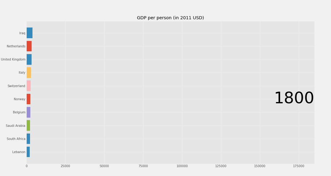
After seeing lots of this type of visualisation going around on Twitter, I wanted to learn how it was done. I decided to use data from the Gapminder Foundation because their data is usually clean and easy to access and start playing around with. I used GDP per capita data for countries from 1800-2020.
Take a look at the GitHub repository to see all the code.
My first attempt is shown to the left, based on the code in this Jupyter Notebook. This version is rudimentary but effective. It shows clearly the trend over time and communicates clearly enough the main points, but it is jerky and lacks the smooth animations when one country overtakes another.
The day I posted mine on twitter I saw that Ted Petrou had released a new package, bar-chart-race, to make it easy to do the same thing. So I gave it a try using that.
This resulted in the video to the right, based on the code in this notebook. This creates a nice animation with smooth transitions when countries change places, with significantly less effort on the part of the user. This is undoubtedly a more polished end product, but I found the process of creating my own bar chart race (of sorts, there is some argument about the criteria that must be met to merit the title) extremely useful in giving practice creating a function which produces a chart based on data, then looping over it to create each frame of the animation. I really enjoyed this project, and hope you have fun playing with the code too.